How-to
How to Build a Professional Website with Webflow: A Step-by-Step Guide
Deals Stacks
How to Build a Professional Website with Webflow: A Step-by-Step Guide
Creating a professional website can feel difficult when you are starting from scratch. You have to think about the design, content, navigation, mobile experience, SEO, and many other details. Webflow makes this process easier by allowing you to visually build and customize a website without needing to write everything from scratch.
Whether you are creating a business website, portfolio, agency website, SaaS website, blog, landing page, or personal brand, Webflow gives you the flexibility to create a modern and professional online presence.
The key is to build your website step by step instead of trying to complete everything at once.
Step 1: Decide What Your Website Is For
Before you start designing, first decide what you want your website to achieve.
For example, your goal could be to:
Get more customers
Generate leads
Promote your services
Sell products
Showcase your portfolio
Build your personal brand
Publish blog content
Get people to book a consultation
Having one clear main goal will help you make better decisions about your design and content.
For example, if you are building a website for a marketing agency, your main goal might be getting potential clients to contact you. In that case, your website should clearly explain your services, show previous work, build trust, and make it easy for visitors to get in touch.
Step 2: Plan Your Website Pages
Once you know your goal, decide which pages you need.
A simple business website could include:
Home
About
Services
Portfolio
Blog
Contact
You don’t need to create dozens of pages in the beginning. Start with the pages that are most important to your visitors.
Think about the journey you want visitors to follow.
For example:
Home → Services → Portfolio → Contact
This gives visitors a simple path from learning about your business to taking action.
Step 3: Prepare Your Content
Before designing every section, prepare the content you want to use.
Collect your:
Logo
Brand colors
Images
Product screenshots
Headlines
Service descriptions
Testimonials
Contact details
Social media links
Blog content
Having your content ready makes the design process much easier.
It also prevents a common problem where people create a beautiful layout first and then realize they don’t have enough content to fill it properly.
Step 4: Start a New Webflow Project
Now open Webflow and create a new project.
You can start with a blank website if you want to create everything yourself. You can also use a template if you want a ready-made design that you can customize.
If you’re new to Webflow, a template can be a good starting point because you can study how the different sections are organized and then change them to match your brand.
If you already have a clear design idea, starting from a blank project gives you more control.
Step 5: Build Your Website Structure
Start by creating the basic structure of your website.
Think of your website like a building. Before decorating the rooms, you need to create the basic structure.
In Webflow, you can use sections, containers, div blocks, and other layout elements to organize your page.
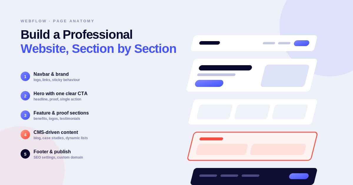
A typical homepage might look like this:
Navigation
↓
Hero Section
↓
Features or Services
↓
Benefits
↓
Testimonials
↓
FAQ
↓
Call to Action
↓
Footer
This structure gives your visitors a clear path through the page.
Step 6: Create Your Navigation Bar
Your navigation is one of the first things visitors will notice.
Keep it simple and easy to understand.
For example:
Logo | Home | About | Services | Blog | Contact | Get Started
Avoid adding too many links to your main navigation.
If you have an important action, such as booking a demo or contacting your company, make that button easy to notice.
A good navigation system helps visitors find what they need without having to search through the entire website.
Step 7: Design the Hero Section
The hero section is the first major section visitors see.
It should quickly explain what your business or website is about.
A simple hero could include:
Headline:
Build Better Websites Without Complicated Development
Description:
Create modern, responsive websites with a flexible visual website-building platform.
Button:
Get Started
Your headline should be easy to understand.
Don’t try to make it complicated just to sound impressive. Visitors should understand your main offer within a few seconds.
Step 8: Add Your Main Sections
After the hero section, start adding the sections that explain your business or product.
For example, a service-based website could include:
About Us
Briefly explain who you are and what you do.
Services
Explain the main services you provide.
Benefits
Show visitors how your services can help them.
Testimonials
Add real customer feedback to build trust.
Portfolio
Show examples of your previous work.
FAQ
Answer common questions.
Final CTA
Give visitors one clear next step.
Each section should have a purpose. Avoid adding sections just because they look good.
Step 9: Create a Consistent Design
A professional website should have a consistent visual style.
Choose a small set of:
Colors
Fonts
Button styles
Heading styles
Spacing
Image styles
For example, if your primary button is rounded with a particular font and size, use the same style throughout the website.
Consistency makes your website feel more polished and professional.
Step 10: Use Webflow’s Layout Tools
Webflow gives you powerful tools for creating website layouts.
Flexbox is useful for arranging elements in rows or columns. It works particularly well for navigation bars, buttons, cards, and simple layouts.
Grid is useful when you need more control over multiple columns and rows.
For example, you can use Grid to create:
Feature cards
Pricing sections
Image galleries
Blog layouts
Product sections
Learning these layout tools will make it much easier to create responsive websites.
Step 11: Make Your Website Responsive
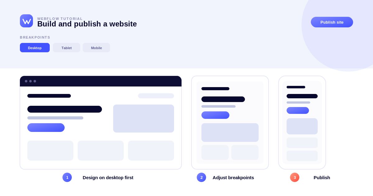
Your website should work properly on different screen sizes.
Check your design on:
Desktop
Laptop
Tablet
Mobile
Look carefully at your:
Navigation
Text size
Images
Buttons
Columns
Cards
Forms
Section spacing
A layout that looks great on a large desktop screen might look crowded on a phone.
Don’t simply make everything smaller. Rearrange elements when necessary so the mobile experience feels natural.
Step 12: Add Images and Media
Use high-quality images that support your content.
For example:
A SaaS website can show product screenshots.
An agency website can show previous projects.
A portfolio can showcase completed work.
A restaurant can show its food and location.
Avoid using random images just to fill empty space. Every image should support the message of the page.
Step 13: Add CMS Content
If you regularly publish content, Webflow’s CMS can make your workflow much easier.
You can create collections for:
Blog posts
Products
Services
Team members
Case studies
Testimonials
Events
For example, a blog collection might contain:
Title → Author → Category → Image → Date → Article Content
Once the structure is created, you can add new articles without designing every page from scratch.
This is particularly useful for websites that need to publish content regularly.
Step 14: Optimize Your Website for SEO
SEO should be considered while building your website, not only after it is finished.
Start by using clear and relevant page titles.
Create useful meta descriptions for important pages.
Use headings properly and organize your content logically.
Keep your URLs simple and descriptive.
For example:
/web-design-services
is easier to understand than:
/page12345
Also add descriptive alt text to important images and create internal links between related pages.
The goal is to make your website easy for both visitors and search engines to understand.
Step 15: Optimize for AI Search and AEO
Search behavior is changing, so it is also useful to think about Answer Engine Optimization (AEO).
Your content should be clear enough for AI-powered search systems to understand.
You can improve this by:
Answering questions directly
Using descriptive headings
Providing useful information
Keeping content updated
Organizing information clearly
Using consistent terminology
Creating helpful FAQ sections
For example, instead of using a vague heading such as:
Our Solutions
you could use:
Website Design Services for Small Businesses
The second heading immediately tells the reader what the section is about.
Step 16: Add Calls to Action
Every important page should guide visitors toward a useful next step.
Your CTA could be:
Start Free
Book a Demo
Contact Us
Get a Quote
Learn More
Request a Consultation
Avoid using generic buttons such as “Click Here” when you can explain exactly what will happen.
A clear CTA makes the website easier to use and can improve conversions.
Step 17: Add Contact Forms
If you want visitors to contact your business, add a simple form.
For example:
Name
Message
Send Message
Don’t ask for unnecessary information.
The shorter and easier the form is, the less effort visitors need to make before contacting you.
Step 18: Add Interactions Carefully
Webflow allows you to create animations and interactions.
You can add effects to:
Buttons
Images
Navigation
Cards
Sections
Page transitions
However, don’t overuse animations.
A professional website should feel smooth and modern without becoming distracting.
Use animation when it improves the user experience rather than simply because it is available.
Step 19: Check Accessibility
Make sure your website can be used by as many people as possible.
Check:
Text readability
Color contrast
Image alt text
Heading structure
Keyboard navigation
Form labels
Button descriptions
Accessibility isn’t just a technical requirement. It also makes your website easier to use for everyone.
Step 20: Test Your Website
Before publishing, go through the entire website carefully.
Check every:
Page
Button
Link
Form
Image
Navigation item
Also look for:
Spelling mistakes
Broken links
Missing images
Incorrect information
Placeholder text
Poor mobile layouts
Ask someone else to test the website if possible. A fresh pair of eyes can often find problems you missed.
Step 21: Test the Mobile Version
Spend extra time checking your mobile website.
Make sure:
Text is readable
Buttons are easy to tap
Images fit correctly
Navigation works
Sections don’t overlap
There is no unnecessary horizontal scrolling
Many visitors may access your website from their phones, so mobile usability should be treated as a priority rather than an afterthought.
Step 22: Review SEO and Content
Before launching, perform one final content review.
Ask yourself:
Is every page title clear?
Are the headings organized?
Are important keywords used naturally?
Are the URLs understandable?
Are images optimized?
Are internal links working?
Is the content useful?
Are there any outdated details?
Don’t force keywords into every sentence.
Good SEO content should sound natural and be written primarily for the reader.
Step 23: Publish Your Website
Once everything is ready, publish your website.
Before making it public, make sure your domain is correctly connected and your final version has been reviewed.
After publishing, open the live website yourself.
Check the homepage, navigation, forms, images, and important pages one more time.
Sometimes something that looked perfect in the editor can behave differently on the live website.
Step 24: Keep Improving Your Website
Launching the website isn’t the end.
After your website is live, continue improving it.
Look at:
Which pages receive the most visitors
Which pages generate leads
Which content performs well
Where visitors leave
Which CTAs receive clicks
Which pages need updated information
Use this information to improve your website over time.
A professional website should evolve as your business and audience change.
Final Thoughts
Building a professional website with Webflow becomes much easier when you break the process into smaller steps.
Start with a clear goal, understand your audience, plan your pages, and prepare your content before focusing heavily on the visual design. Then use Webflow’s design and layout tools to create a clean website that works well across desktop and mobile devices.
Don’t forget the parts that are easy to overlook, such as SEO, accessibility, forms, page speed, and content organization.
Most importantly, don’t try to make your website complicated just to make it look professional.
A great website is usually clear, easy to navigate, responsive, useful, and focused on helping visitors take the right action.
With a well-planned structure and consistent design, Webflow can help you turn a simple idea into a professional website that you can continue improving as your business grows.